
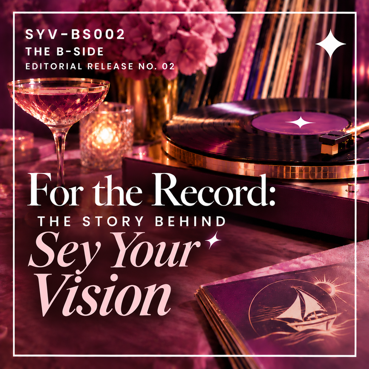
If you've spent any time exploring Sey Your Vision's website, you've probably noticed that it doesn't look much like a traditional marketing studio. There are vinyl records, a sailing ship, plenty of purple and pink, and more than a few references to music. My services are called The Collection, my portfolio is The Discography, and even my newsletter and blog have their own musical identities.
There's a reason for all of it. Actually, there are several.
Sey Your Vision's identity is a collection of personal stories, family history, creative interests, and business decisions that have developed over time. Some elements have been here since the beginning. Others found their place more recently. And while the latest redesign gave everything a new look, the purpose behind the business has remained remarkably consistent.
So, I thought I'd take you behind the brand and share how it all came together!
It Started With a Vision
When I created Sey Your Vision, I wanted to help entrepreneurs bring their ideas, or visions, to life. I've always understood that a business is more than a business to the person building it. It's their baby. They've invested their time, resources, hopes, and energy into creating something that matters to them. I wanted Sey Your Vision to be a place where entrepreneurs could feel comfortable entrusting a marketing professional with their digital presence.
The name itself is a play on the phrase “see the vision” and my own name, Kelsey. I wanted it to reflect the importance of understanding what another person is trying to accomplish rather than imposing my own ideas on their business. After all, it's your vision.
Over the years, the services I've offered have expanded, and my understanding of what it takes to build a business has grown alongside them. But that original intention hasn't changed. Whether I'm working on brand strategy, a website, or digital marketing, the goal is still to help entrepreneurs develop and communicate their visions.
A Ship With a Story
The sailing ship in my logo has been part of Sey Your Vision since its earliest days. It wasn't chosen simply because I thought a ship would look nice in a logo, although I do happen to like it.
My name, Kelsey, means “ship's victory.” The imagery also serves as an homage to my ancestors, who arrived here aboard various ships. I wanted to carry a little of that family history into something I was creating for myself. When I eventually redesigned the logo, keeping the ship was important to me. What changed was its surroundings. I decided I wanted a vinyl record to represent the sun, which meant the ship needed somewhere to sail. It ended up on the water, and as an Aquarius, I was perfectly happy with that arrangement!
I like that the finished design brings together different pieces of my identity without abandoning the original inspiration. The ship still has its meaning, but now it belongs to a larger visual story.
Music Has Always Been Part of My Story
My relationship with music began long before I owned a record player.
Neither of my parents was a musician, but both were music enthusiasts. I grew up listening, learning artists' names at an early age, and developing an appreciation for music that never really went away. Eventually, I inherited several record collections, which opened the door to collecting vinyl myself. And, according to family lore, vinyl may have played a role in my existence. My parents once had an argument over a broken Spandau Ballet record. They made up, and I was born.
I'll let you draw your own conclusions about that one.
Music has remained a constant in my life, and The Record Lair (my personal space for listening to and enjoying records) is an extension of that enthusiasm. It's colorful, nostalgic, and influenced by the glamour of the 1970s. When I began reconsidering Sey Your Vision's visual identity, bringing vinyl into the design felt natural. It wasn't a matter of choosing a retro aesthetic because it happened to be fashionable. Records were already part of my life, and I liked the idea of bringing that enthusiasm into my business. What began as a design element eventually inspired an entirely different way of thinking about the website.
A Little Color, a Lot of History
I've never been especially interested in making Sey Your Vision look like a conventional corporate business. I've never felt that I fit particularly well into the corporate world as it exists, and I didn't see much reason to recreate that atmosphere in a business of my own.
Purple was an obvious choice because I've always loved it. Pink is a nod to my previous brand, The CanSurvivor, and a chapter of my life that remains part of my story. Teal is another color found in my office, while gold accents complement the 1970s influence running through The Record Lair.
There are sparkles as well.
Not every creative decision needs a complicated explanation involving color psychology or a carefully constructed metaphor. Sometimes a color belongs in a brand because it has a genuine connection to the person behind it. The challenge is bringing those preferences together in a way that feels intentional and cohesive. I wanted an identity that was expressive, recognizable, and unmistakably mine without compromising professionalism. I believe you can take your work seriously without taking yourself too seriously, and I wanted Sey Your Vision to reflect that. A little personality and fun can make the experience all the more enjoyable.
Welcome to the Record Lair
When I began redesigning the website, I knew I didn't want visitors to feel as though they'd arrived at a typical marketing studio. I wanted the experience to resemble stepping into a record store.
I love the idea of browsing through a collection, discovering something unexpected, and finding something that catches your attention. There's a sense of exploration to the experience, and I wanted to capture a little of that feeling online.
That's how the website's musical terminology developed.
The Collection became the home for my services, while The Discography became the place to showcase my work. My monthly newsletter became The A-Side: All-Access, and the blog you're reading right now became The B-Side, where I can share the stories, ideas, and thinking behind the work.
I wanted those details to make the experience distinctive and enjoyable, not simply decorative. Visitors should feel like they're exploring a place with its own personality.
Of course, there's a balance to strike. A creative experience is only successful if people can still find what they're looking for.
And that brings me to the practical reason behind this latest evolution.
When the Cover Art Needs More Than a Refresh
Believe it or not, the redesign began with a font.
A few people had difficulty reading my original logo. I had grown attached to the identity, but when people struggle to read your business name, that's a pretty good indication that something needs attention.
Initially, I thought about refreshing the logo. Then I started asking myself what else could be improved.
My website wasn't attracting the clientele I'd hoped for, and I suspected the previous concept was too abstract. I liked the creative direction, but I wasn't convinced visitors could easily understand everything I offered or how those services might help them.
With a name like Sey Your Vision, that's especially important. The name communicates a philosophy, but it doesn't immediately explain that I work in branding, website design, and digital marketing. It was important for the rest of the website to provide that clarity.
So the project became bigger than a new logo or a different color palette. I reconsidered how my services were described, how visitors moved through the website, and how the entire experience communicated what Sey Your Vision actually does.
I didn't just need to refresh the cover art. I needed to revisit the entire record.
The goal wasn't to make the business less creative. It was to make the creativity and the communication work together.
The Vision Remains the Same
Sey Your Vision looks quite different from the business I originally launched, and I expect it will continue to evolve. That's part of building something over time. You learn, you develop new skills, you reconsider decisions, and occasionally you discover that the font you loved isn't doing you any favors.
But underneath the vinyl records, the sailing ship, the colors, and the sparkle is the same idea that inspired the name.
I want entrepreneurs to know they're working with someone who understands how important their businesses are to them. Someone who takes the work seriously, knows what she's doing, and believes the process can still be enjoyable.
I don't think professionalism requires everyone to look, sound, or work the same way. And I certainly don't think a business needs to sacrifice its personality to be taken seriously.
That's what I wanted Sey Your Vision to reflect.
The presentation has changed. The services have grown. The record collection has gotten a little bigger.
But the vision? That's still the same.