
Live with Noble Intention.
Something beautiful is coming.
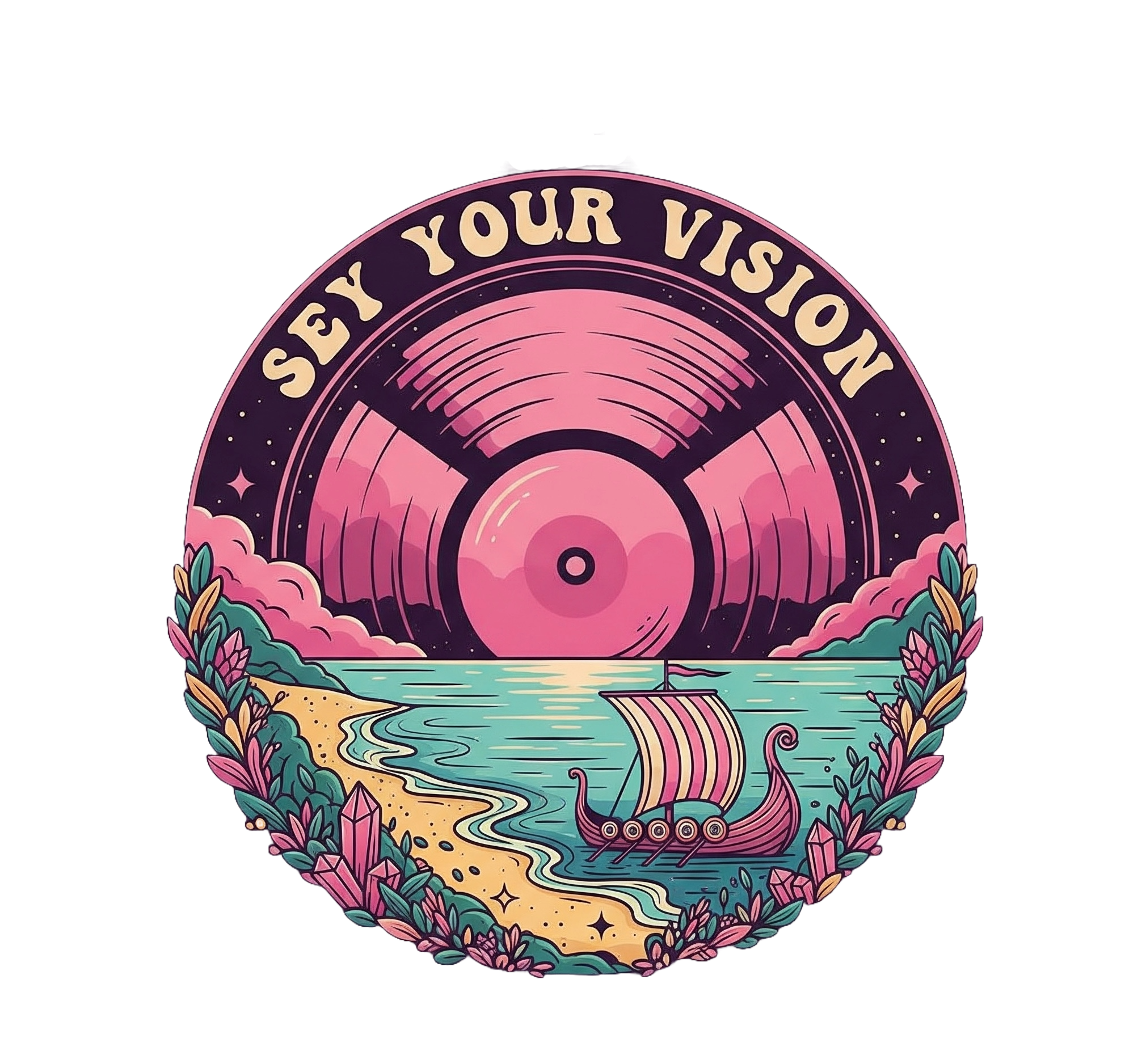
A new vision, a new podcast, and a new conversation about building a life that feels as good as it looks. A daily dose of B.R.A.V.E.R.Y. for your finances, goals, and well-being, hosted by Sey, the Modern Countess.
Be the First to Know.
Join the Noble Notes newsletter and be the first to receive notice of the official launch, exclusive behind-the-scenes content, and your first dose of Vitamin Sey.